
A good president should also be a good marketer, and a good marketer knows how to convert people into participants. So which presidential candidate’s website is poised for better conversion?
I will take a look at the websites of three presidential candidates and examine the user-friendliness and potential conversion value. And the nominees for this test are… Ron Paul, Hillary Clinton, and John McCain.

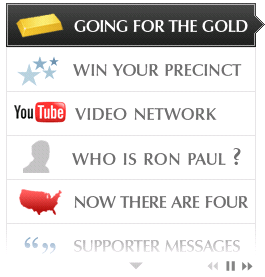
The top of the site has an easy-to-use navigation which points users to various topic pages and the left side of the page features a more interactive navigation where users can watch a YouTube video of Ron Paul, read support messages, and find out more about who Ron Paul is.
Not too shabby of a website. However, the website is too passive-aggressive. Searchers are like pirates searching for treasure on a site. Finding the treasure should be an easy task: it should pop out at the searcher. In Ron Paul’s case, where is the treasure? Sure I can click the giant “donate button” but that’s about all I can do without actually doing some treasure hunting.
Not only that, a lot of great copy and information is found below the fold of the website. This refers to any content that I actually have to scroll down to see. Once I scroll down, what do I find? A ha! buried treasure.
This is a gold mine, but what is it doing hidden on the right side of the page below the fold?
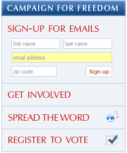
This box has vital calls to action that encourage site visitors to do a number of things. This should be one of the first things that the visitor sees.
There is also a plethora of other valuable information found below the fold like press releases and networking information.
Overall, the site is not bad but could definitely use some improvement. If Ron Paul wants to increase his conversion rate and make his site more user-friendly, he should place all the important copy above the fold, call out action items, and minimize the scrolling a searcher needs to do to find content.
Now let’s take a look at Hillary Clinton’s website.
Hillary Clinton has a great website with prominent calls to action. Minimal scrolling to view the entire home page, a huge plus. The searcher can easily find the treasure on the site, no clicking around required. This page is optimized to increase and promote conversion. Notice the difference between Hillary’s site and Ron Paul’s site? Think semantics. How about the use of the word “contribute” vs the word “donate?” “Contribute” requires more commitment and involvement whereas “donate” does not. How long do you think it took the team of staffers to debate this very topic?
Hillary used to have a “5 things you can do” box on the left hand side of the page above the fold, now its trapped at the bottom. Ron Paul has something similar on his site, also buried below the fold on the right side of the page. My question is WHY? Why would you put something like this below the fold, the answer is you shouldn’t! Also, pay special attention to how many times the page calls for a contribution.
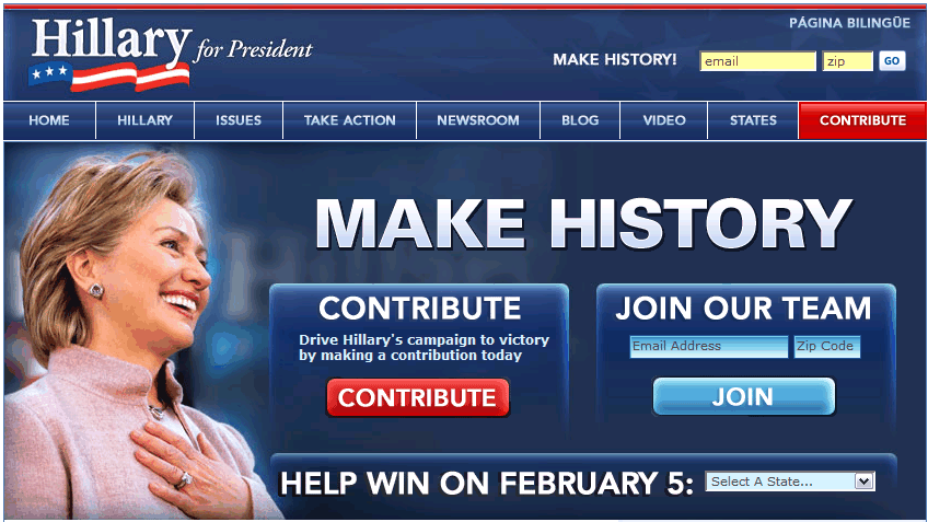
To further increase conversion and action, the navigation bar on top of the page has a tab called “Take Action.” Notice how virtually all the important copy can be found with minimal scrolling. The latest videos and blogs can be viewed straight from the homepage; the searcher can even buy Hillary Clinton gear without scrolling to another section of the site.
Overall, the page has a good approach to maximizing conversion (it used to be great and aggressive!). However, there are still a few things I would change.
First of all, I would place the “treasure” on the upper left side of the page. The reason for this is that the upper left hand of the page is usually the first spot a searcher views. You want visitors to immediately see that calls to action box.
I would also bring up the web 2.0 section above the fold. Online user communities are becoming more and more popular and presidential candidates should maximize their use.
Finally, let’s take a gander at John McCain’s website.
First off you will notice that all three of these candidates have very similar websites. Now I’m not saying that they were all designed by the same fellow but there is some serious overlap. Where did originality go?
John McCain also has a well designed website filled with rich media (just like the other candidates). The homepage is short and sweet; most of the content can be found above the fold. The navigation bar points to the essentials and also includes his blog and McCainspace. McCainspace (how clever!) allows visitors to join an exclusive John McCain community where they can create their own website devoted to devoted to you know who. Think affiliate marketing but for politics and that is exactly what McCain space is. A clever idea, but instead of having a separate tab about it, I would have stuck it on the homepage, perhaps with a little widget that says: “Join the McCainspace community,” or “Create your own John McCain site.”
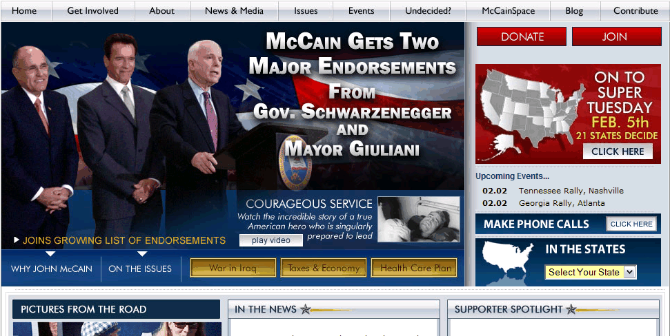
The homepage does a good job of letting visitors know how to join or contribute. I would still make the donate and join buttons larger and stick them smack in the middle of the page or toward the left side. These should be the first things that visitors see (there used to be giant gold text that read “Charlie Crist!”)
Ron and Hillary did a good job of utilizing social media but where is John’s web 2.0 stuff? Where are the links to his online communities? I would also like to see a few more action items posted on the homepage. Give visitors options for how they can help out the campaign, give them a marketing vehicle and let them drive. Hillary did a great job of this on her page.
People visiting presidential candidate’s websites are most likely looking for one of two things: information about the candidate OR a way to help out the candidate. Therefore, these should be the two easiest things to find on any presidential candidate’s web site. Don’t make visitors dig or the treasure, show it to them!
I’m gad to see that the presidential candidates are starting to make good use of the participation architecture of web 2.0 and interactive media to help market themselves. Now, we’ll see whose internet strategy bears fruit come November 2008!

Comments